Thursday, July 20, 2017

Adding a Modal Template to a Legacy Theme in APEX 5

Modal dialogs are a native feature in APEX 5. Unfortunately for some users, although they have upgraded to APEX 5 they are still using an older theme that does not support native modals. Most developers get a bit discouraged when they think they can easily create a modal page, but because of their theme they find that the Modal Dialog and Non-Modal Dialog Page Mode options are disabled when trying to create a new page.

Modal Dialog Option Disabled

To enable these options, you need to modify your theme to contain a Modal Dialog template. To make things easier, I copy the Popup template as a starting point. Just go to Shared Components > Templates and search for the Popup page template. Click on the copy icon and in the wizard, give the new template a name, I called mine Modal.
Shared Components > Templates

Once your modal template is created, edit it and change the Template Type from Normal Page to Dialog Page.
Template Type

Next, scroll down to the Javascript section and enter the following (these are the default values that can be found by examining the help text of the items):

Dialog Initialization Code:

apex.navigation.dialog(#PAGE_URL#,{title:#TITLE#,height:#DIALOG_HEIGHT#
     ,width:#DIALOG_WIDTH#,maxWidth:#DIALOG_MAX_WIDTH#,modal:#IS_MODAL#
     ,dialog:#DIALOG#,#DIALOG_ATTRIBUTES#},#DIALOG_CSS_CLASSES#,#TRIGGERING_ELEMENT#);

Dialog Closure Code:

apex.navigation.dialog.close(#IS_MODAL#,#TARGET#);

Dialog Cancel Code:

apex.navigation.dialog.cancel(#IS_MODAL#);

Now, you will want to apply your changes. Your new modal template is now done, but if you were to try and create a modal page at this point, you would still find that the Modal Dialog Page Mode option is disabled. To fix this, you need to update your theme properties to reference your new modal template.

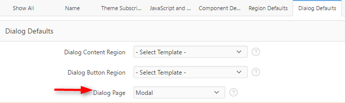
Navigate to Shared Components > Themes and click on the name of your current theme.
Shared Components > Themes

Move to the Dialog Defaults section and set the Dialog Page to the name of your new template, in this case Modal. You can also select the default templates for the Dialog Content Region and Button Regions, if you know what you would like to set them to.
Dialog Defaults

At this point, the Modal Dialog option will be enabled in the page creation wizard. Give it a try!

-Jackie-

P.S. While this solution will work in a pinch - you really should, at least, consider moving to the Universal Theme. Check out all of the reasons why here.

Monday, July 10, 2017

Dynamically Expand a Collapsible Region

I use collapsible regions in APEX all the time. Mostly, to hide away audit information that most users don’t really care about but a few people might want to see. I usually default them to load in the collapsed state so that I can keep a page clutter-free until the user decides they want to take a gander at what lies within. But, what if there is some important information inside the collapsible region? What if the user never expands the region? Don’t worry - its pretty easy to dynamically expand a collapsible region when it has content and collapse it when it doesn’t.

Simply create a collapsible region and go ahead and default it to the collapsed state. For this example, my region contains a classic report. You will also need a hidden page item to store the number of records your collapsible region contains or otherwise determine if your region needs to be expanded.

Collapsible region & hidden page item

Next, create a dynamic action that fires on page load, this will control the initial state of the region.

Expand Region - Dynamic Action

The first True action sets the value of the hidden page item. This value determines if the collapsible region has any content. In my case, this is simple - I just need to count the number of rows in the table:

Action: Set Value
Set Type: SQL Statement
SQL Statement: select count(*) from jsd_notes
Items to Submit: P20_NUM_NOTIFICATIONS

The second True action expands or collapses the region, if needed:

Action: Execute Javascript Code
Code:

 var numEntries = $v("P20_NUM_NOTIFICATIONS")
   , $region = $(this.affectedElements[0]);
  
 if (numEntries > 0 && $region.hasClass('is-collapsed') ) {
      $region.find("button.t-Button--hideShow").eq(0).click();
  }
  
 if (numEntries < 1 && $region.hasClass('is-expanded') ) {
      $region.find("button.t-Button--hideShow").eq(0).click();
  }

Affected Elements - Selection Type: Region
Region: Notifications

The JavaScript code above looks at the value of the hidden page item and if that value is greater than zero and the current state of the region is collapsed, it will find the hideShow button of the region and call the click method, causing the region to expand. The same is true for the opposite - if the region no longer contains any data and is in the expanded state, the region will collapse.

This finished functionality is shown below:

Auto Expand & Collapse Demo

Demo Here

In my demo application I also used this same dynamic action functionality to fire on dialog close and after delete of a row. This way I know the report is in the state I want it.

I am sure there are a multitude of other ways to accomplish this, but this is what worked for me. I hope it can help you as well.

- Jackie -